
↘Cotopaxi Annual Report
Overview
Cotopaxi has a brand that I love, and they’re product popularity has been skyrocketing. The company’s success is reflected in their annual report, with sustainability efforts, increase in profits, and product ingenuity as some of the major highlights. This company’s report was chosen for a hypothetical redesign because of its recent growth, success, and iconic imagery.
The current visual identity of the brand is fun, inviting, colorful, tailors to specific collaborations, and utilizes the iconic/recognizable Cotopaxi alpaca image.
Programs
Adobe Illustrator and Indesign

Branding
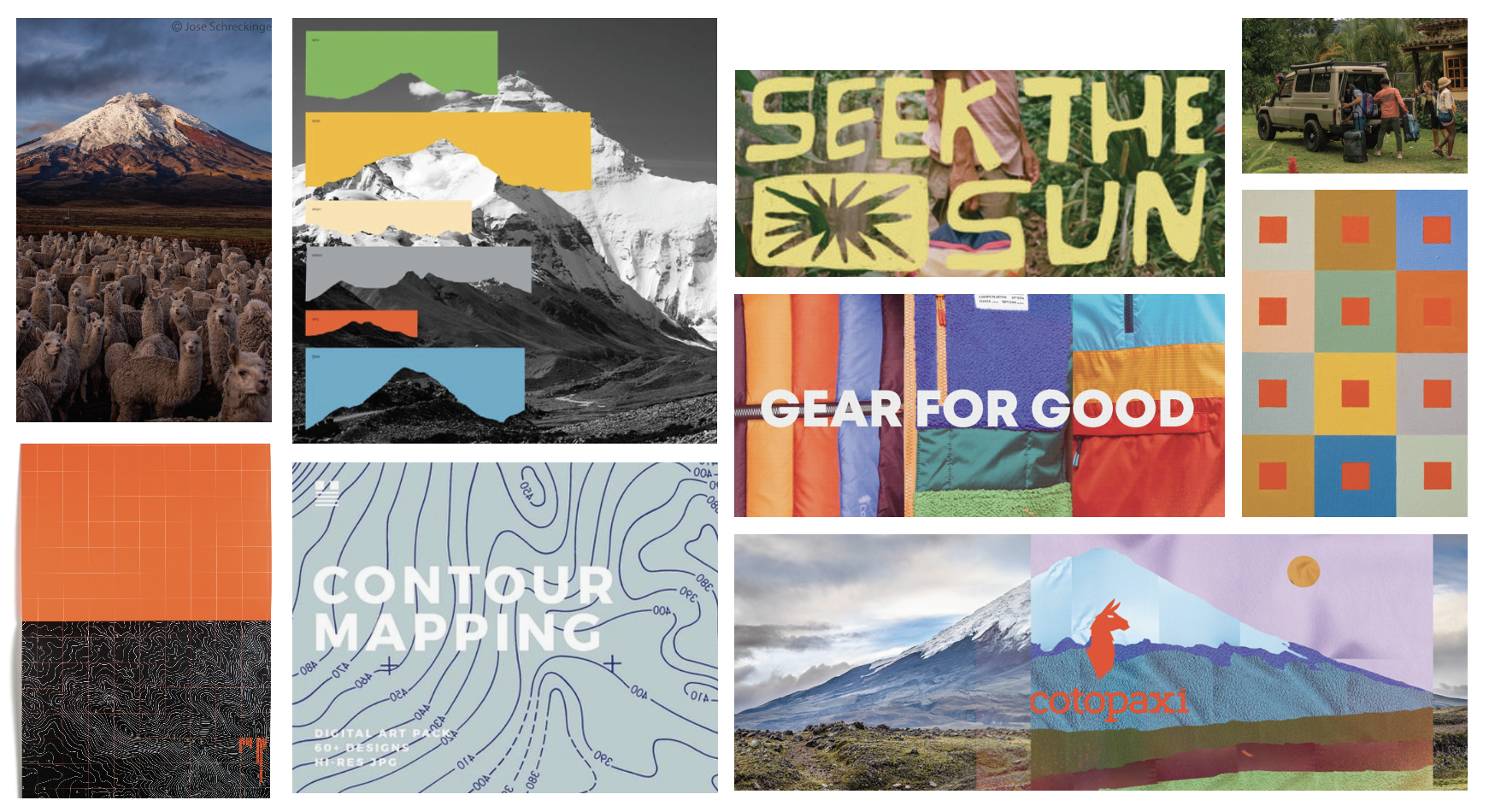
Mood Board


Custom Logo


Sketches
Style Guide
Typography
I redid the Cotopaxi logo for the cover with a custom typeface, but the Cotopaxi logo uses a font very similar to Rockwell. So since I am using my version of the logo. For the secondary text I chose Muli for its legibility because of the amount of body.
Brand Color + Illustration
The color palette for the app was inspired by bright sea glass and more cautionary neon colors.


Final Pages
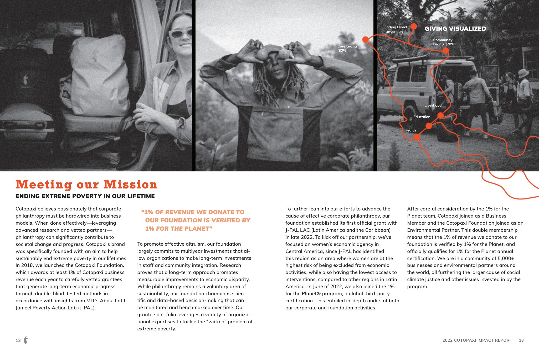
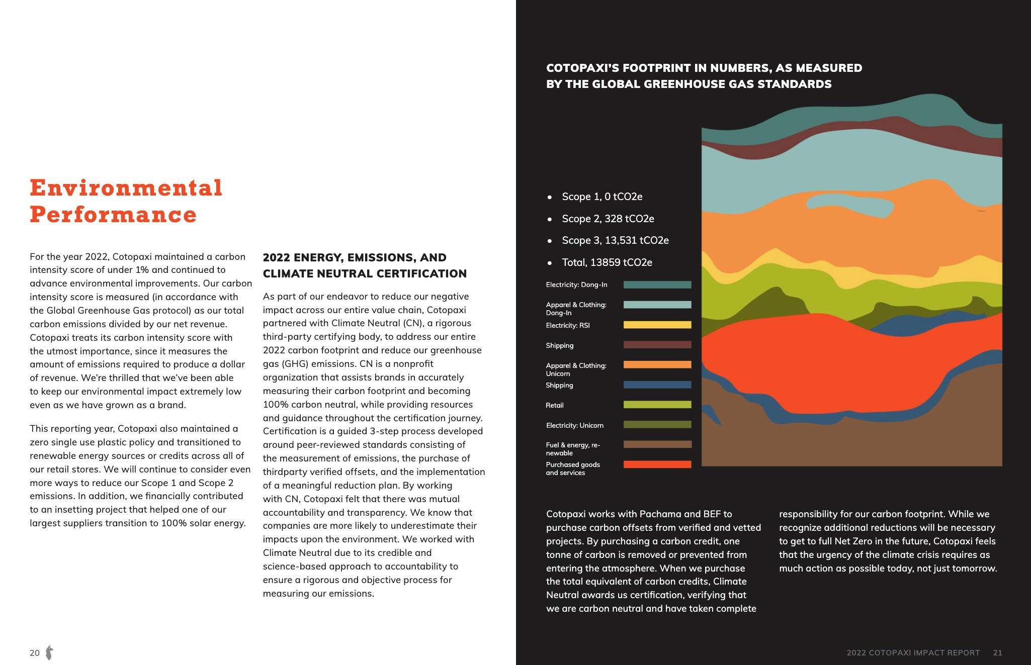

These are some of the pages.
If you didn’t want to click the link
and go to a new window.